


Rodriceprez
mikko816
RaventailBlacktalon
Belfegor666
jakdarkinc
Kayke
absolute-freak
zeescribe
jillzy
Martinux
StromStrider
PhoenixAzura
Watching 12
paintisthenewdope
kekepk
Bensonator
quietzs
amrphous
RekhesAuSebek
aeater
Plunkqwette
cheeeserocks
PainPixie
Reima
BSLuGeth
Collection
Favourites


Deviation Spotlight
Artist // Student
- United States
- Deviant for 19 years
- He / Him
Badges

My Bio
So far I've barely enrolled in my first real art class. Don't expect too much up here, but I do throw up the occasional thing.
Current Residence: Virginia
Operating System: Windows XP
Wallpaper of choice: Frequently changing large pictures
Current Residence: Virginia
Operating System: Windows XP
Wallpaper of choice: Frequently changing large pictures
Favourite Movies
Good Will Hunting
Favourite Bands / Musical Artists
blink-182
Favourite Writers
Heinlein
Favourite Games
Starcraft
Told you so.
0 min read
There we go, several new things up. Now I just have to figure out what I'm going to do next... great.
Join the community to add your comment. Already a deviant? Log In
Oh god so sore.
0 min read
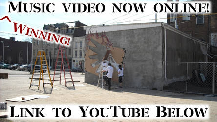
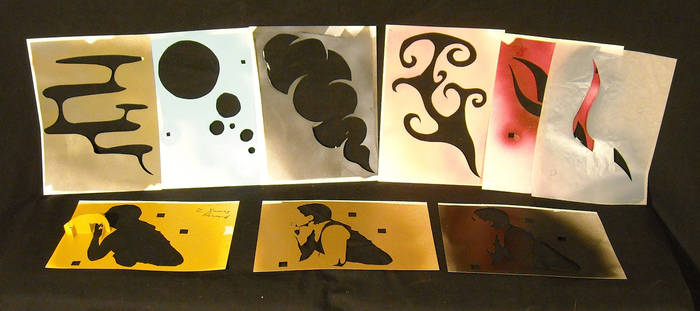
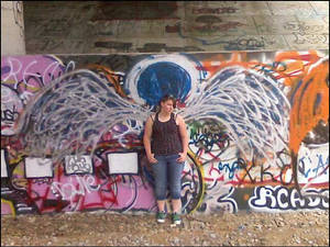
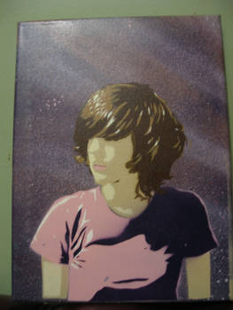
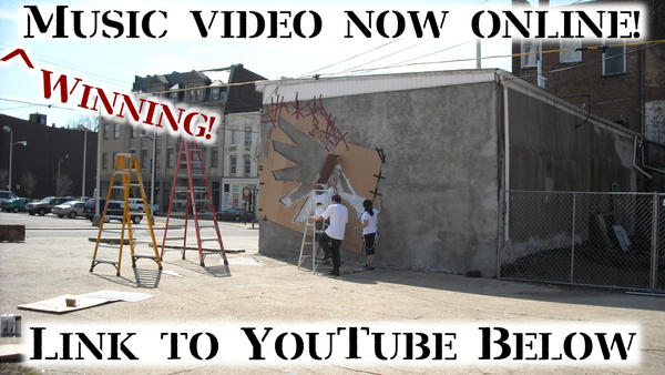
Well, it took around seven hours of painting from start to finish, but the stencil is painted. I also took some portfolio pictures, so there should be a LOT of new stuff up fairly soon.
Join the community to add your comment. Already a deviant? Log In
APPROVED!!
0 min read
So, the 20 foot wide stencil in my scraps? Yeah, just got that bitch approved. So, once I get some cardboard to sketch it out on, I'll be sailing smooth.
Join the community to add your comment. Already a deviant? Log In
Profile Comments 35
Join the community to add your comment. Already a deviant? Log In
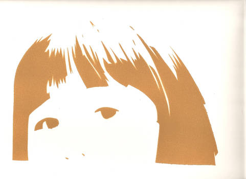
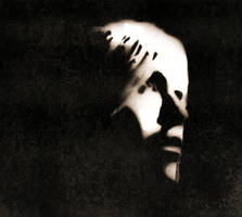
Thanks for the actually constructive criticism. But I've got a question:
I'll get a couple of the sections cleaned up, and probably change the width of some of the breaks. That really depends on what I do with the font however. Ya see, I used that font because it's the official Watchmen font. (Future Bold Condensed or something, I don't feel like checking at the moment, lol) I wanted to keep the whole thing watchmen themed, so I used it. I just need to find a good looking way to add some breaks so that holes can remain, but it will still look consistent, and like the Watchmen font. Any ideas for that?
I'll get a couple of the sections cleaned up, and probably change the width of some of the breaks. That really depends on what I do with the font however. Ya see, I used that font because it's the official Watchmen font. (Future Bold Condensed or something, I don't feel like checking at the moment, lol) I wanted to keep the whole thing watchmen themed, so I used it. I just need to find a good looking way to add some breaks so that holes can remain, but it will still look consistent, and like the Watchmen font. Any ideas for that?
First off, the font. If you want to keep it, that's cool. Look at other stencil fonts, and see how they bridge islands. Copy those solutions to your font. Try to make it flow if possible, but people know stencil text needs bridges, and it won't be a big issue.
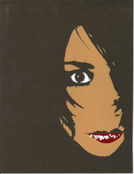
For the hat island, move it up to the edge of the black or add a curving bridge. The trick is to make it look like an odd fold or highlight rather than an obvious connecting piece. Same idea goes for the face. This is an ink slot, so make some trailing streaks that happen to connect it all.
For the hat island, move it up to the edge of the black or add a curving bridge. The trick is to make it look like an odd fold or highlight rather than an obvious connecting piece. Same idea goes for the face. This is an ink slot, so make some trailing streaks that happen to connect it all.
Ok, great, thanks for the help. I think I know what you mean here. I'll get on it soon enough and re-post it ASAP. Be sure to check it out, ok?
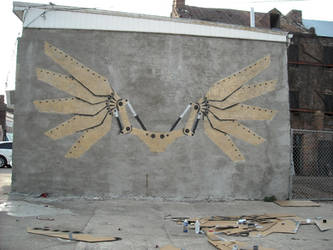
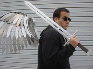
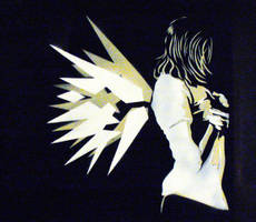
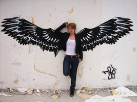
thanks for the fav, nice stencils - specially "wings"
thanks for the fave on when i look to the sky
Thanks for the  ^^
^^
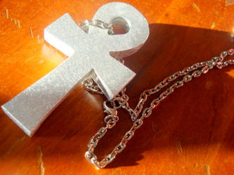
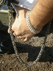
Thanks very much for all your comments, love the metal-work.
I'm a bit of a jack of all trades (engineer) but I'm a neophyte to welding and metal-work in general so it's really great to see what's possible with a bit of imagination and no small amount of skill. (Smile)")
I'm a bit of a jack of all trades (engineer) but I'm a neophyte to welding and metal-work in general so it's really great to see what's possible with a bit of imagination and no small amount of skill.